Speaking at WebConf 2023: Reviving Icon Fonts with Modern Typography

(opens in new window)Behind The Presentation
Imagine a company where a design system had grown to over 300 SVG icon files. Every time they needed to update an icon’s color scheme or add a new variant, designers had to export new SVG files, developers had to replace old imports, and QA team had to verify changes across dozens of components. A simple color change could take half a day.
Worse, their HTML was bloated with inline SVG code. Each icon meant dozens of path coordinates cluttering the markup. Their homepage alone had 2,400 lines of SVG markup just for icons. Page size ballooned, and the code was nearly impossible to read.
Icon fonts could have solved this. They render as text, keeping HTML clean and allowing instant color changes via CSS. But we’d abandoned icon fonts years ago because they had fatal flaws: blurry rendering on high resolution screens, single-color limitations, and no animation support beyond basic CSS transforms (e.g., ping, pluse and spin).
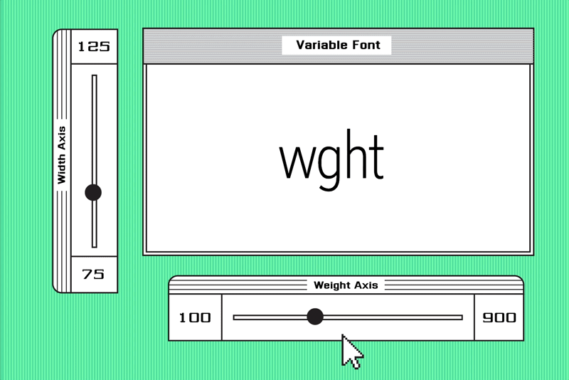
However, font technology had quietly evolved. Variable Fonts arrived in 2016. Color font formats matured. Browser support became universal. The problems that killed icon fonts were now solved.
I researched whether these new technologies could make icon fonts viable again, then presented my findings at WebConf Taiwan 2023(opens in new window) to an audience of 150+ frontend developers and designers.
(opens in new window)Technical Solution & Approach
(opens in new window)OpenType Ligatures: Making Icons Readable
Old icon fonts required memorizing Unicode code points or adding CSS pseudo-elements for every icon. I recommended using OpenType ligatures instead, the same technology that converts fi into a single connected letterform in professional typography.
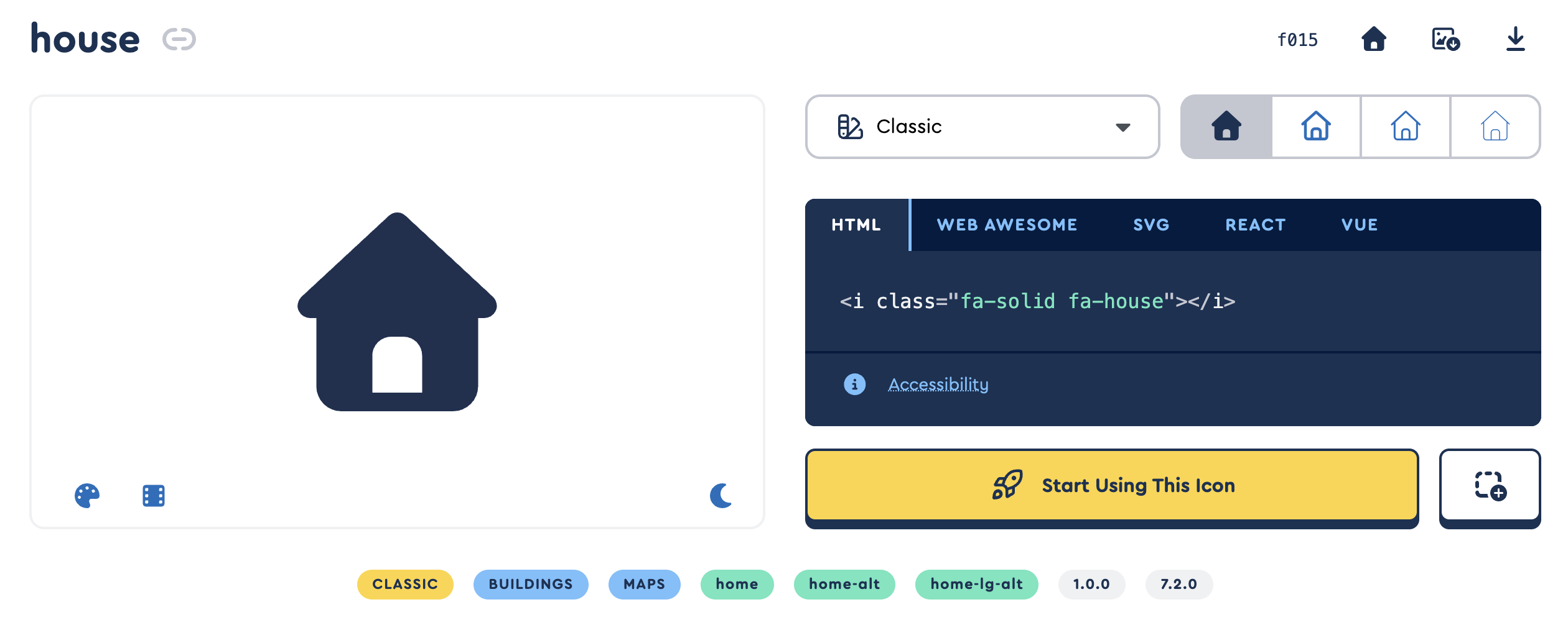
Traditional approaches like Font Awesome(opens in new window) rely on class names (<i class="fa-solid fa-file"></i>), where CSS searches for fa- prefixed elements and injects icons via pseudo-elements. This requires managing CSS rules for every icon, and the actual icon content is hidden in stylesheet declarations.
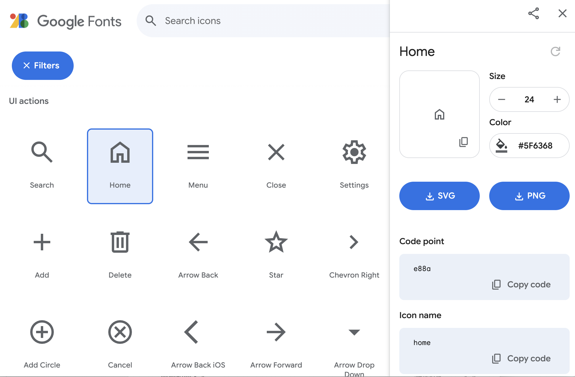
Modern icon font projects like Google Material Icons(opens in new window) take a different approach: they use OpenType ligature features to map semantic text to icon glyphs. When you write <span class="material-symbols-outlined">home</span>, the ligature feature automatically maps the text home to its corresponding Unicode code point U+E5D2 in the font, which then renders the house icon. Your HTML stays clean and readable. No pseudo-elements, no Unicode lookups, just semantic text that renders as icons.
(opens in new window)COLR/CPAL: Multi-Color Icons Without Multiple Files
The COLR/CPAL color font format solves the single-color limitation that killed old icon fonts. Instead of embedding bitmaps or SVG data, it defines icons as layers of vector shapes, each with its own color. You can ship multiple color palettes in one font file and switch between them using a single CSS property.
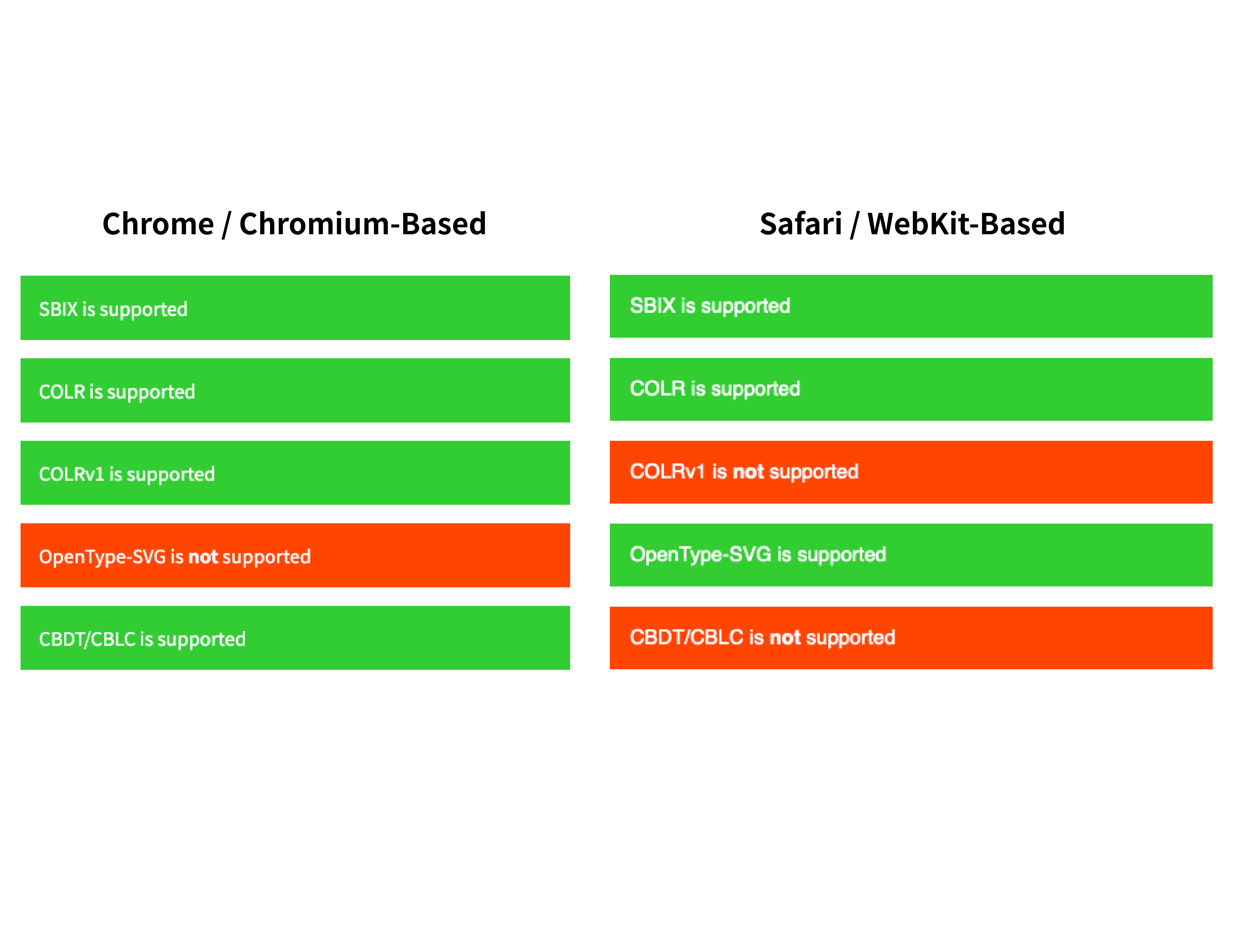
This architecture is more maintainable than managing separate SVG files for each color variant. One font file contains all the color schemes, and you control which palette renders through CSS. Chrome, Firefox, Safari, and Edge have all begun supporting the COLR v0 format, while the newer COLR v1 format is gradually gaining browser support. This newer color font format even supports vector gradients and shape reuse(opens in new window), opening up far more possibilities for icon color design.


The top emoji demonstrates COLR v0 with solid color fills, while the bottom one shows COLR v1 with gradient support.
Browser support for COLR/CPAL proved better than expected. COLR v0 works universally across modern browsers, while v1 features like gradients have strong support in Chrome and Edge, with Firefox and Safari catching up.
I implemented a progressive enhancement strategy that serves Variable Color Fonts to modern browsers, falls back to static fonts for partial support, and uses OpenType-SVG color font format for legacy environments. This ensures over 95% of users benefit from the improved technology while maintaining universal compatibility.
(opens in new window)Variable Fonts: Animation Without JavaScript
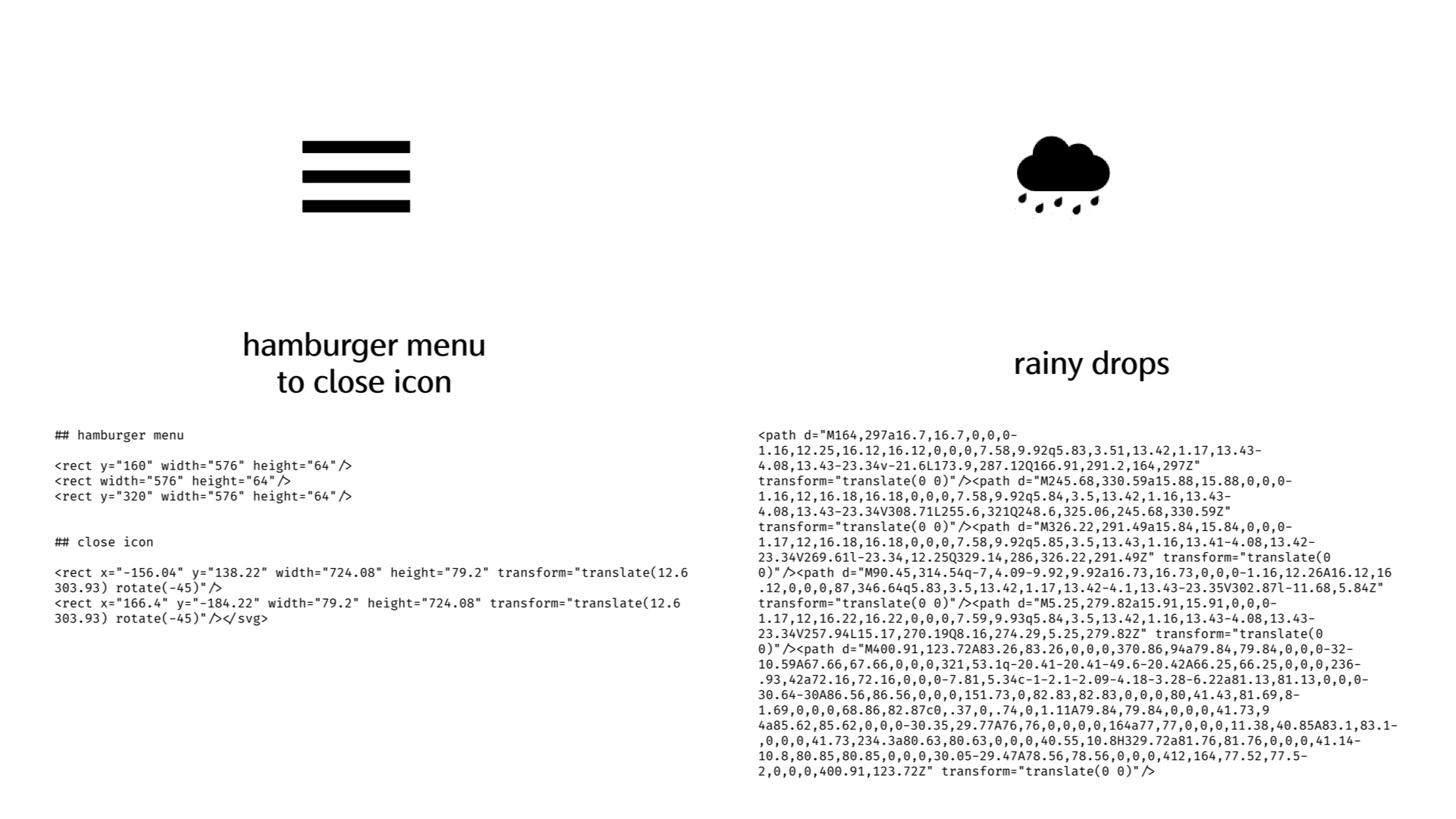
Variable Fonts use interpolation between design extremes to create smooth transitions. You design two states (say, a cloud with raindrops inside and a cloud with raindrops fallen), and the font calculates every frame in between.
For animated icons, this is transformative. With SVG, animating multiple elements requires targeting each raindrop individually, setting staggered delays, and writing complex keyframe CSS for position, scale, and opacity. That’s dozens of lines of CSS per icon. With Variable Fonts, you define one custom axis (like anim ranging 0-100) and let the font handle the interpolation math. A single CSS property animates the entire icon smoothly.
Many teams also use Lottie(opens in new window) for animated icons, which offers more expressive animation capabilities. However, Lottie requires dedicated design tools like Adobe After Effects, introduces runtime library overhead, and can be harder to maintain since animations are exported as JSON data rather than being controllable via CSS. For complex illustrations or brand animations, Lottie excels. But for simple icon animations in design systems, Variable Fonts offer a compelling middle ground: more capable than CSS-animated SVG, simpler to integrate than Lottie.
I demonstrated this with an animated weather icon. While the SVG equivalent needed dozens of lines managing multiple elements, the Variable Font version required just a two-line CSS animation changing one value. The complexity lives in the font file, not in your codebase.
The scalability advantage becomes clear when managing design systems. For 100+ animated icons, the Variable Font approach means maintaining one font file with embedded animation logic, rather than writing and maintaining individual CSS animation code for each icon. One CSS rule controls the animation state across all icons, dramatically reducing maintenance overhead.
Variable Fonts have been supported across all modern browsers since 2018, making this technology production-ready for most projects today.
(opens in new window)Adoption: Examples & Barriers
Type foundries are already exploring these capabilities. Typearture(opens in new window) created experimental animated variable font(opens in new window) that demonstrate advanced Variable Color Font techniques.
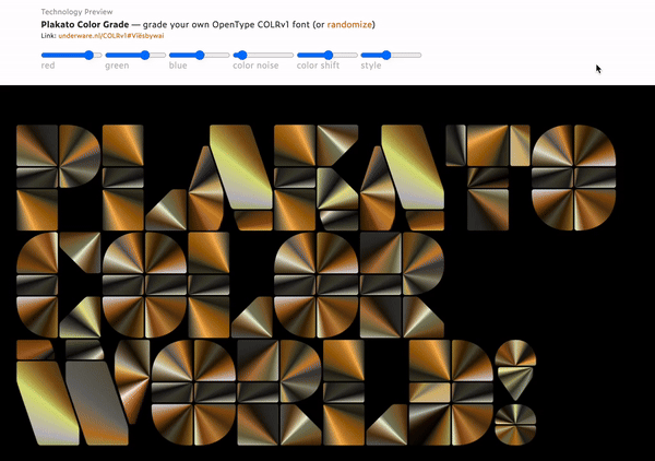
Underware(opens in new window)’s Plakato Color Grade(opens in new window) ships with 1,360 built-in color palettes controllable through font variation axes. These production examples prove the technology is mature enough for real-world use, not just research demonstrations.
Despite these impressive demonstrations, widespread adoption still faces barriers. The technical problems that killed icon fonts are solved, but adoption faces a different challenge: expertise. Most designers work in Adobe Illustrator and can export SVG files instantly. Creating a font file requires learning specialized tools like Glyphs, which have steeper learning curves.
The barrier shifted from technical limitations to design workflow integration. For small teams, SVG remains the path of least resistance. But large organizations building design systems gain significant advantages from icon fonts: single source of truth for updates, consistent rendering metrics, global theme switching via CSS, reusable animation logic, and smaller bundle sizes compared to hundreds of SVG imports.
(opens in new window)Impact & Results
The presentation reached over 150 frontend developers and designers at WebConf Taiwan 2023. After the presentation, several designers and engineers shared their current implementation approaches with me, exchanging ideas about the future possibilities of icon fonts. Many were surprised to learn the technology had evolved so significantly since they’d written off icon fonts years ago.
The core insight resonated: we’re not choosing between icon fonts and SVG anymore. We’re choosing the right tool for the context. For large design systems managing hundreds of icons across multiple themes, Variable Color Fonts offer advantages SVG can’t match: single source of truth, instant palette switching, animation logic embedded in the font, and cleaner HTML. For one-off illustrations or projects without typography expertise, SVG remains the better choice.
My research demonstrated that icon fonts deserve reconsideration, not because they’re superior, but because they’re now viable for use cases where they failed before.
(opens in new window)Lessons Learned
This research taught me that dismissed technologies sometimes deserve reconsideration. Icon fonts weren’t obsolete. They were waiting for related technologies to mature. Variable Fonts and color palettes arrived separately, but combining them created something more capable than either technology alone.
The experience also reinforced that adoption barriers aren’t always technical. Even when browser support is universal and performance is excellent, workflow integration matters more for most teams. The best technical solution isn’t always the most practical one.
Most importantly, I learned to question industry consensus. When everyone agrees that SVG won and icon fonts are dead, it’s worth asking whether that’s still true or just conventional wisdom that hasn’t been reexamined.