Open Huninn: Designing an Open-Source Rounded Typeface for Taiwan
(opens in new window)Behind The Project
Traditional Chinese fonts are extraordinarily hard to make. A basic Latin font needs around 500 characters. A Chinese font needs at least 7,000 for everyday use, and 15,000+ for newspapers and magazines. Even a skilled designer can only create 20 to 40 characters per day. That’s why most open source Chinese fonts come from large companies like Google and Adobe (e.g., Noto Font Family(opens in new window)). Small foundries can’t afford the time and resources.
The few open source options that existed for rounded styles were Japanese fonts (which require only ~2,000 Chinese characters, making them less resource-intensive to produce). But Japanese fonts don’t work for Taiwanese users. Chinese characters aren’t uniform across East Asia. The same character can have different stroke structures depending on regional standards.
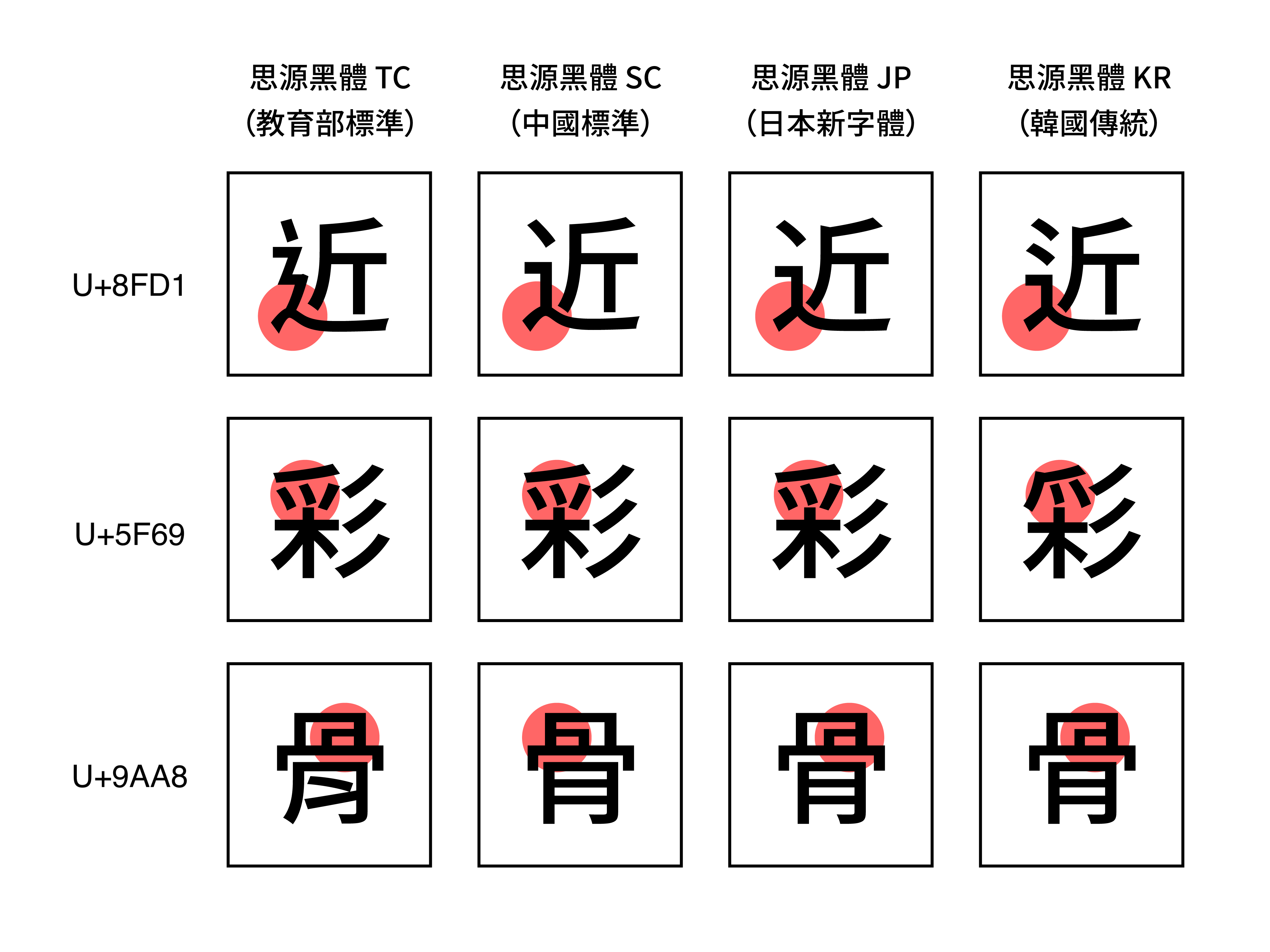
As Noto Sans CJK shown above, TC (Taiwan’s Ministry of Education standard), JP (Japanese standard), SC (Simplified Chinese standard), and KR (Korean old forms) each follow distinct conventions. While Chinese characters have been used across the region for thousands of years, standardization only began in recent centuries, leading each area to adopt different forms.
It’s not like spelling differences between American and British English (like color and colour), it’s more like how Russian and Bulgarian Cyrillic use the same letters but with visibly different shapes. As shown in the image below, red characters represent the same "letter" written differently, while green characters are letters unique to each country’s writing system.

Japanese font follows Japanese writing standards, which differ from Taiwanese. And because Japanese uses fewer Chinese character than Taiwanese, Japanese fonts leave Taiwanese users with tofu boxes, blank squares where missing characters should appear.
Taiwan also isn’t just using Chinese Character. Taigi (Taiwanese Hokkien), Taiwanese Hakka, and indigenous languages each have their own phonetic systems and unique Latin characters. No existing rounded font supported any of them. Our team at justfont set out to change this: we would build the first open source rounded typeface specifically made for users in Taiwan.
(opens in new window)Approach
(opens in new window)Designing More Glyphs
We built Open Huninn (jf open 粉圓) on top of Kosugi Maru(opens in new window) and Varela Round(opens in new window). The font was funded by backers of the 2015 Jin-Xuan Typeface Crowdfunding Project by justfont(opens in new window), and we released it under the SIL Open Font License to give back to the community.
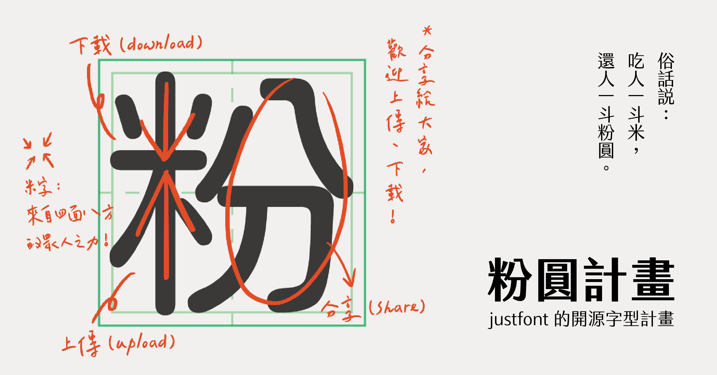
The core design work was adding every missing character Taiwanese users actually need. The final count includes 3,547 frequently used Traditional Chinese characters not present in the Japanese source font, Bopomofo (Zhuyin) phonetic symbols specific to Taiwan, and additional latin characters and symbols for Taigi, Hakka and indigenous language writing systems.
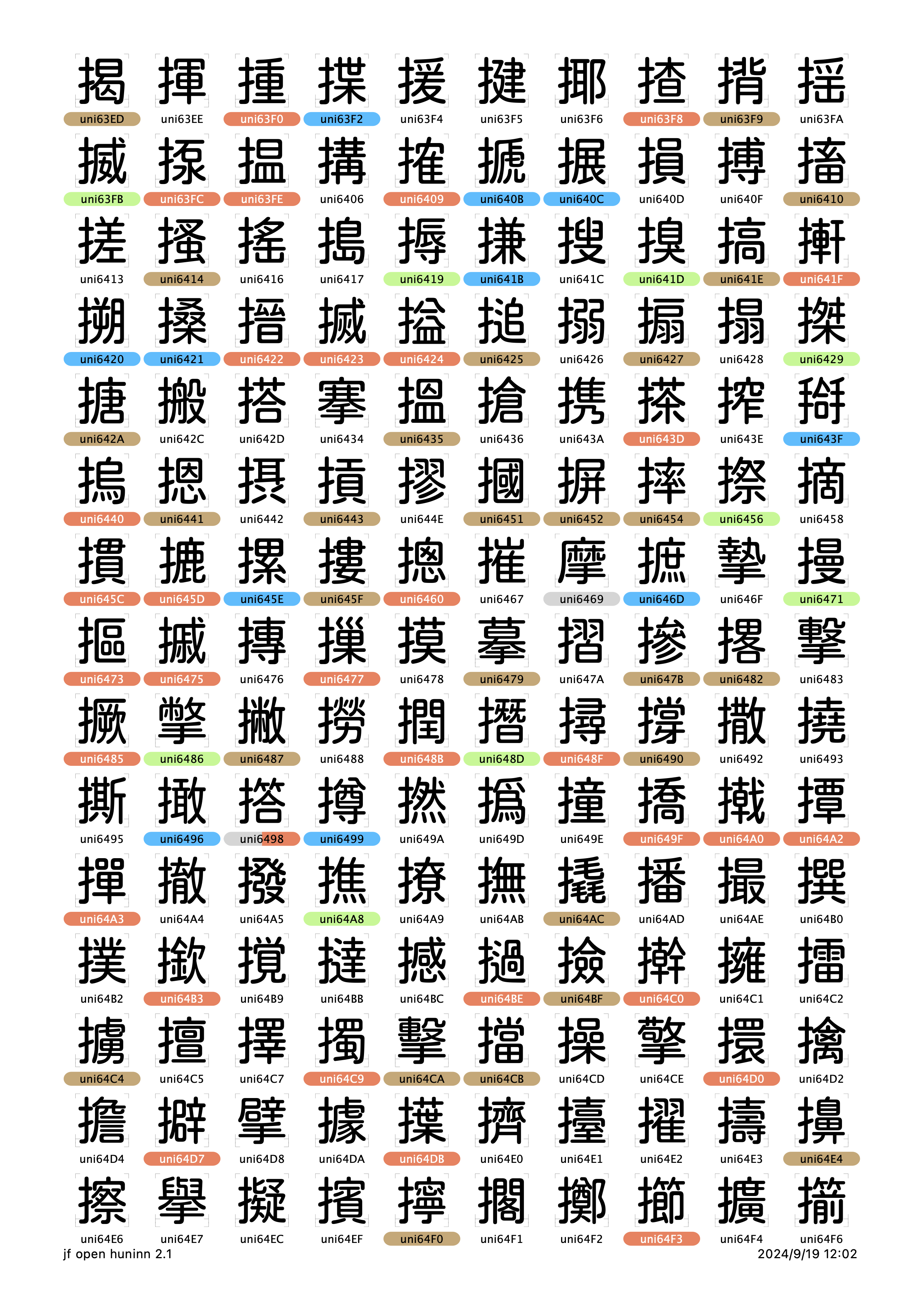
The image below shows one page from an 83 page glyph chart. The colored characters represent glyphs that were added or modified in the Open Huninn project. These include a large number of Chinese characters commonly used in daily life in Taiwan but not included in the Japanese standard. For Taiwanese users to use the font in their everyday lives, every single one of these characters is essential.
As the typeface designer and engineer, I designed hundreds of new glyphs, built the entire font production pipeline, and ensured the font works correctly across all major platforms. Working closely with our lead designer, I was responsible for both the visual design work and the technical engineering that turned design files into a shipping, production-grade font.
(opens in new window)Redesigning for Modern Screens
Kosugi Maru was designed for old low-resolution screens, which meant visual compromises: thicker outer strokes and thinner inner strokes to improve legibility on pixel-limited displays. On modern high-resolution screens, these compromises looked uneven. The font also had poor grayscale, the visual density when you squint at a block of text, because stroke weights varied inconsistently across characters.
I rebalanced the entire font for modern displays and print. Using Glyphs, I adjusted stroke weights for consistent grayscale, fine-tuned character spacing and kerning, ensured uniform visual weight across all 3,500+ new glyphs, and refined proportions to improve overall legibility. The result is a font that looks even and polished whether it’s displayed on a Retina screen, printed on paper, or embedded in a mobile app.
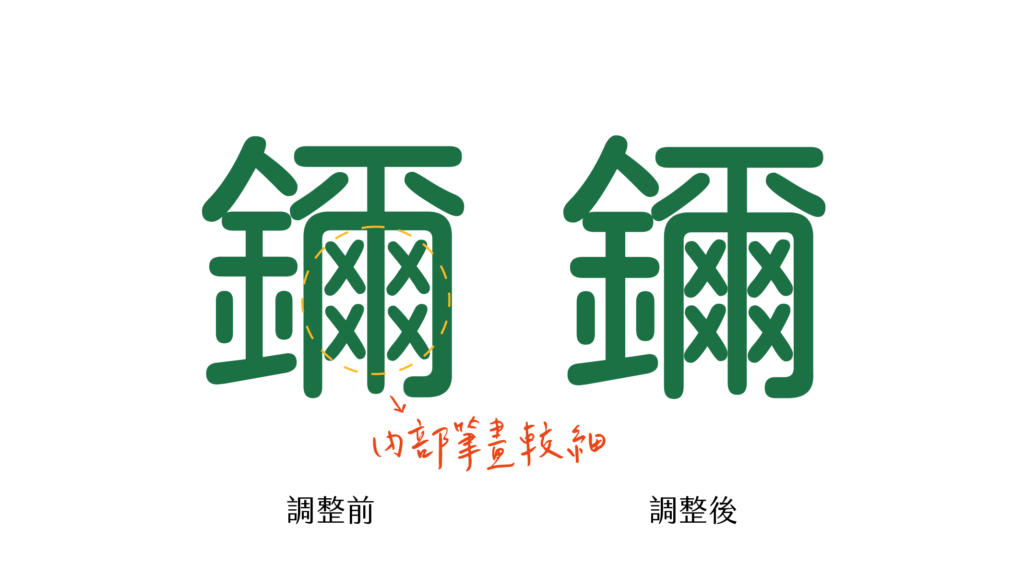
Left: Kosugi Maru optimized for old screens. Right: Open Huninn optimized for modern displays.
(opens in new window)Fixing Punctuation for Taiwan
Japanese punctuation sits in the lower-left corner of the character grid. Taiwanese punctuation should be centered. This may sound minor, but incorrect punctuation placement is one of the most visible signs that a font wasn’t designed for your language. It’s immediately noticeable in any body text.
I repositioned every punctuation mark to match Taiwan’s typesetting rules, ensuring the font reads naturally for Taiwanese users rather than feeling like a Japanese import.
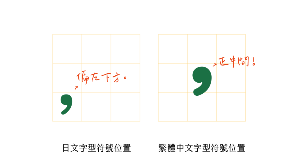
Left: Japanese punctuation (lower-left). Right: Taiwanese punctuation (centered).
(opens in new window)Building the Production Pipeline
Beyond design, I engineered the entire font build pipeline. I wrote Python scripts using FontTools(opens in new window) that merge glyphs from multiple source fonts, validate character coverage against target character sets, generate multiple font formats including TTF, OTF, WOFF, and WOFF2, and run quality checks before each release. I also set up git workflows for version control, making it straightforward for contributors to submit improvements.
(opens in new window)Publish on Google Font
This pipeline became essential when we pursued one of the project’s biggest milestones: getting Huninn accepted into Google Fonts. Google’s font library has strict quality standards.
Google Fonts ran automated checks using tools like fontbakery(opens in new window) and gftools(opens in new window), and we went through multiple rounds of feedback and fixes. I prepared the font files to meet their specifications, fixed metadata and naming tables, wrote the required documentation, and iterated through their review process until approval.
Getting into Google Fonts meant anyone could use Huninn with a simple embed code tag for webfont, no download required. This made the font instantly accessible to millions of developers and designers worldwide.
(opens in new window)Impact & Results
We released Open Huninn v1.0 on March 14, 2020, under the SIL Open Font License. Since then, we’ve continued to improve it, releasing v2.1 in September 2024 with additional refinements and bug fixes.
Open Huninn has been downloaded hundreds of thousands of times** from designers, developers, and everyday users across multiple platforms. Our successful submission to Google Fonts(opens in new window)** made it instantly accessible to millions of developers worldwide—anyone can now use the font with a simple embed code, no download required.
The community response has been remarkable. Multiple derivative fonts have been created, including Inherit TangYuan(opens in new window) and TaiwanPearl(opens in new window), building on our work to serve even more specialized needs. The font is now used in schools, government documents, and commercial products across Taiwan, becoming part of the country’s digital infrastructure.
Most importantly, Open Huninn has preserved Taiwanese linguistic diversity by supporting Hokkien, Hakka, and indigenous language writing systems that were previously difficult to type digitally. These communities finally have a beautiful, modern font that represents their languages with the same quality as mainstream Mandarin text.
(opens in new window)Lessons Learned
Since launch, the Huninn font has been downloaded hundreds of thousands of times and inspired multiple derivative works. It’s not just a font. It’s infrastructure for Taiwanese digital culture.
This project taught me that type design is as much about cultural understanding as it is about visual skill. The difference between a Japanese font and a Taiwanese font isn’t just missing characters. It’s punctuation placement, stroke structure conventions, and support for languages that most font designers never consider. Understanding these cultural requirements shaped every design decision, from which characters to prioritize to how punctuation should be positioned.
Building the automated font pipeline changed how I think about design production. Manually exporting and checking font files doesn’t scale when you’re maintaining thousands of glyphs across multiple formats. The Python scripts I wrote for automated validation and generation saved weeks of manual work across each release cycle and made it possible for the community to contribute without breaking things.
The Google Fonts submission process taught me the gap between works on my machine and production-grade. Meeting their quality standards required attention to metadata, naming conventions, and rendering edge cases that I’d never considered. That experience directly informed how I approach quality in every project since, building to external standards rather than just internal ones.
Most importantly, Open Huninn showed me the impact of building for underserved communities. Taiwanese Hokkien speakers, Hakka writers, and indigenous language communities had been invisible to mainstream font design. By including their characters, we gave them the ability to type their languages in a beautiful, modern font for the first time. The community’s response, including derivative fonts, educational adoption, and government use, proved that well-designed infrastructure creates value far beyond what you initially imagine.