
Loksin: A Calligraphy Font with Auto Contextual Alternates Substitution Feature
- justfont
- Role: Typeface Engineer
- Co-work with: Typeface Designer, Project Manager
- Tools: Glyphs, Python, Git
- Official Website: https://justfont.com/loksin/
Loksin (洛神行書) is a Traditional Chinese Semi-cursive script (行書, a.k.a. running script) typeface created by justfont in collaboration with Taiwanese calligraphy master Chen Yao-Cheng (陳耀成), who has brought his lifetime of expertise in various script styles.
What sets Loksin apart from other calligraphy typefaces is its unique automatic character substitution feature, allowing for dynamic variations in repeated characters (疊字詞, a.k.a. reduplication). As a calligraphy font born in the digital era, Loksin showcases traditional aesthetics and the power of calligraphy through modern OpenType technology.
As a typeface engineer, I am responsible for identifying words that require the substitution feature from different language databases, configuring OpenType features, and testing the font across various software to ensure that Loksin’s unique characteristics are fully worked.
![]()
Niche of Calligraphy Typeface
Creating a unique calligraphic typeface in a market already filled with similar productions requires something special. Inspired by Zapfino designed by Hermann Zapf, which is known for its smooth and variant handwriting style achieved by ligature, we decided to create a Traditional Chinese version of Zapfino that mimics real calligraphy by connecting strokes with nearby characters.
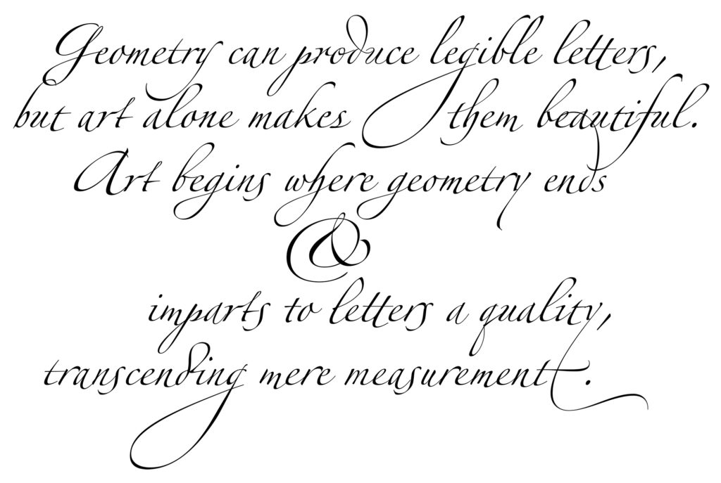
Zapfino is an elegant calligraphic typeface designed by Hermann Zapf. Known for its flowing and decorative letterforms.
However, we quickly realized that this approach presents a huge challenge due to the differences between writing systems. Unlike the 26 Latin letters, which can list all alternates and ligatures, Chinese characters have a big number of glyphs, making it difficult to create ligatures for every possible combination.
Inspired by Latin Ligatures
Due to the complexity, we explored a different approach: altering the appearance of identical characters when they appear together, rather than connecting both glyphs. For instance, when the same character repeats in a word (詞), like two os in tooth, the second o would automatically display slightly differently from the first. This ensures that the typeface represent a natural, handwritten look, even with repeated characters, and prevents it from appearing printed typeface.
We extended this concept to cases where two identical characters are separated by another character. For example, in lilith, both ls and is would show different variations. This approach helps the typeface feel more human and authentic, capturing the essence of handwritten calligraphy.
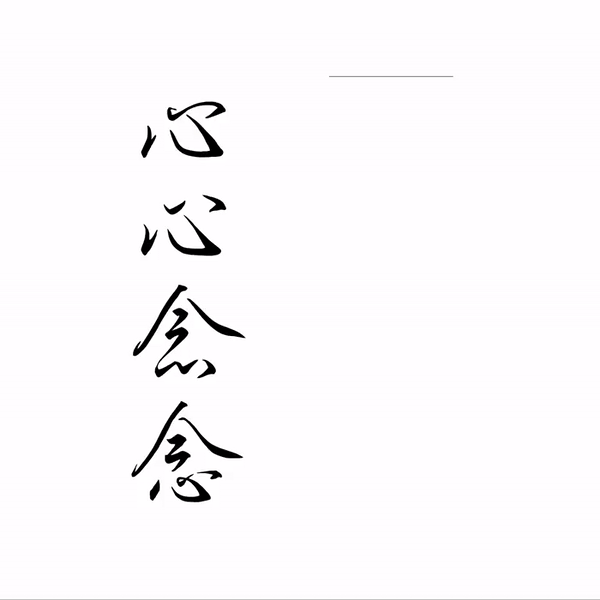
Substitution glyphs for reduplication.
Reduplication in Taiwanese Languages
In Mandarin Chinese, Taiwanese Hokkien (臺語), Hakka (客語), and Yue (粵語, a.k.a. Cantonese), reduplication (疊字詞) is a common way to form words by repeating characters with the same shape and meaning. This feature is often used in adjectives, chengyu (成語, traditional idiomatic expressions), daily expressions, and even interjections.
In Taiwanese Hokkien, reduplication is generally classified into two main types: adjacent reduplication, where the identical characters are next to each other (e.g., AA, AAA, AAB, AABB, ABBA). And separated reduplication: where the repeated characters are separated by another character (e.g., ABAB, ABAC, ABCB).
Particularly with adjectives, adjacent reduplication helps express different levels of intensity: two-character reduplication often means slightly, similar to a comparative sense, while three-character reduplication usually indicates the highest intensity, meaning very or extremely. For instance, 紅 /âng/ means red, 紅紅 /âng-âng/ means a little bit red, and 紅紅紅 /âng-âng-âng/ means very very red.
This feature adds richness to the language, allowing speakers and writers to express tricky differences in meaning and emphasis, making the language more dynamic and expressive.
Data Collection
After deciding to implement reduplication substitution into Loksin, our next step was to gather as much word library as possible to identify all reduplication. For Mandarin Chinese, resources were abundant. In addition to general dictionaries, there are even a specialized published dictionary that focuses exclusively on reduplicated words.
However, when it came to Taiwanese Hokkien, Hakka an Yue, available resources were fewer. Open-source dictionaries for these languages are rare, and even the dictionaries provided by official government tend to focus on normal forms, often omitting the reduplicated forms commonly used in daily communication.
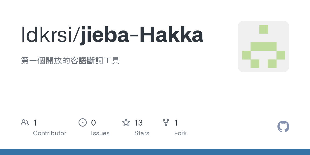
Fortunately, we realized that we could use the dictionary of IMEs as resource. Many open-source IMEs, such as Rime, offer extensive dictionaries of candidate words. Additionally, with recent rise in NLP and LLMs, there have been several open-source repo to develop text segmentation (斷詞) libraries for minority languages, such as jieba. These resources became invaluable for our project.
In the spirit of open source, I have also release our organized reduplication dictionary: Reduplication-Dictionary-Mandarin-Minnan-Hakka-Jyut / rutopio@GitHub. While this dictionary is currently used for our project, we hope that it might find other uses in the future. We are excited to see where it might lead!
OpenType Advanced Feature
After collecting and organizing all necessary data for our project, we can now explore how to implement our idea using OpenType features.
OpenType calt (Contextual Alternates, 上下文替代) feature is designed to handle logical substitutions based on the context of characters. This feature helps make text appear more natural and visually appealing by altering the appearance of certain characters depending on their surrounding context (前後文).
Basic Usage of Contextual Alternates
For example, Latin letters like j, q, g, and y have descenders that can overlap each other when placed close together. To address this, calt can be used to specify rules for replacing characters when they appear in specific sequences. For instance, if g and j are adjacent, the descender of j might be too close to g, creating a visual issue.
With calt, you can replace j with an alternate form, such as j.ss01, when it follows g, allowing for better spacing. When g is not next to j, both g and j retain their original design.
![]()
By using AFDKO (Adobe Font Development Kit for OpenType) tool, you use an apostrophe (') to mark characters for substitution:
feature calt {
    sub g j' by j.ss01;
} calt;
Implementing on Reduplication
Similarly, calt can address issues with reduplication. For example, when two identical characters appear consecutively, you can use calt to change the appearance of the second character. This can also be applied to patterns like ABA, where the second occurrence of a character is substituted to enhance visual harmony.
feature calt {
    # ABB form
    sub 暗 摸 摸' by 摸.ss01;

    # ABA form
    sub 無 暝 無' 日 by 無.ss01;
} calt;
Conclusion
Loksin blends traditional calligraphy with modern life, using OpenType technology to adapt to professional environments. This allows the elegance of classical script to enhance contemporary settings. The auto contextual alternates substitution feature, specifically designed to capture the natural beauty of calligraphy, truly sets Loksin apart.
My role as a typeface engineer was mainly in identifying and configuring words that required the ligature feature, setting up OpenType features like calt, and testing the font to ensure its unique characteristics were preserved across various platforms.
![]()